Room Scheduling Suite
Role: Lead UX Designer
User Research, Information Architecture, Interaction, Prototyping, Visual Design & User Testing
Date:
2020-Present
Product Overview
The Extron Room Scheduling Suite is an ecosystem of hardware and software designed to facilitate the management of work spaces. From interactive wayfinding displays to API calendar integration, the products in this space enable users of all levels of technical expertise to maximize room usage.
Exploring the Ecosystem

Some Notes
- The scheduling touch panels can stand alone, but they are much more effective when used alongside a wayfinding display and occupancy sensors
When integrated, these products enable:
- users to find and reserve spaces ad hoc or in advance
- administrators to configure their system based on the needs of their organization
- decision makers to address meeting room needs and plan for future resourcing
Some additional context…
- This product space is supported by 3 UX Designers and a Visual Designer
- There are 3 distinct Engineering teams that support the various products, working across multiple tech stacks
When integrated, these products enable:
- The scheduling touch panels can stand alone, but they are much more effective when used alongside a wayfinding display and occupancy sensors

Because this case study is an overview of a suite of products, I have included a deep dive of only part of the Design Thinking Process per product…and it’s still super long!
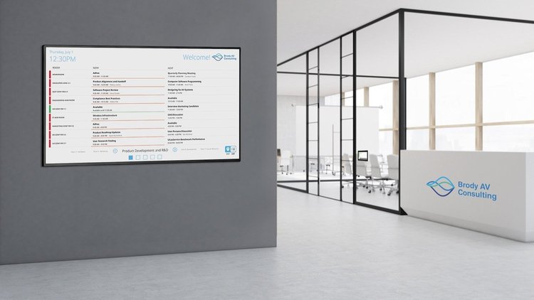
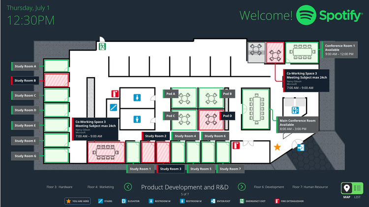
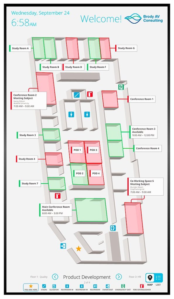
Wayfinding Interface
With a TouchLink Wayfinding Interface, users can view room availability, make a reservation, and find a room from a centralized location.
- When I joined the team, the product already had map and list views which allowed users to book and/or find a room
- Part of my focus has been designing workflows for generating directions to rooms (in a supporting admin application), and for enabling users to access those directions on the panel itself
Light UI Display

Dark UI Display

Empathize and Define
Extron makes a lot of products, but this functionality was brand new. It was essential that we try to understand our users’ challenges and needs, pinpointing the problems that need to be solved.
- Strategically conducting the following kinds of research helped us identify and understand the different user groups
- It also helped us understand their challenges and to ideate on potential solutions
User Interviews
- At Extron, we use many of our own products to utilize and manage our work spaces, so we had access to many internal users of the product suite
- These conversations gave us valuable insights into what our corporate users want and need
- 💰NUGGET: Users like the idea of a centralized map, but they would love to be able to follow directions right from their phone
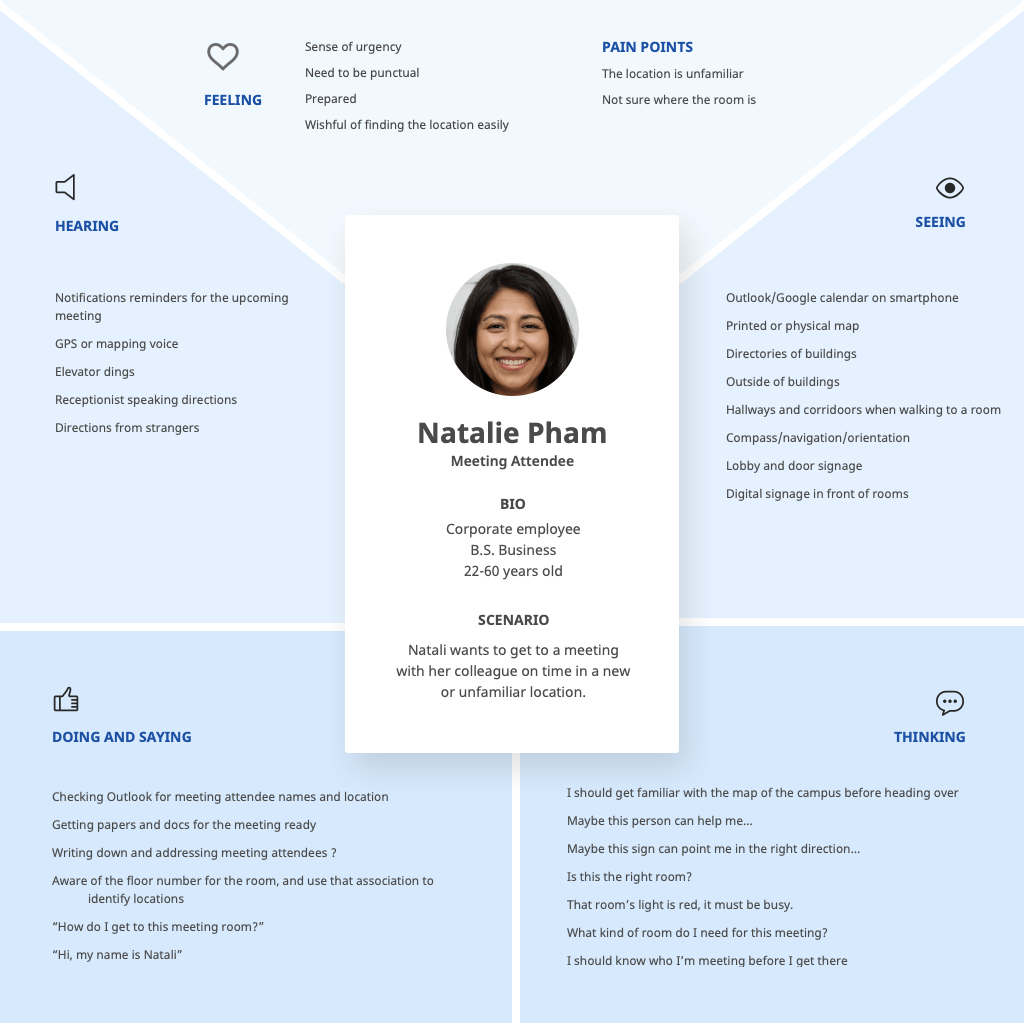
- Based on these interviews, we created empathy maps to keep our users top of mind
Example:
Field Research
- In order to get a better understanding of what our other user groups want and need, we did some ethnographic research
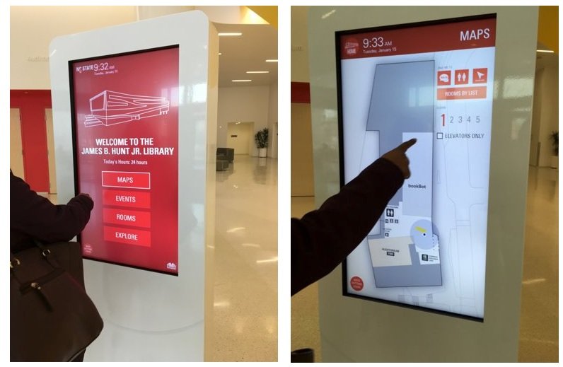
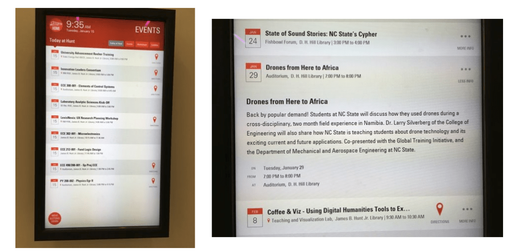
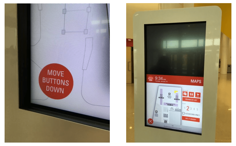
- We observed people interacting with wayfinding displays at multiple locations:
📍 NC State Hunt Library
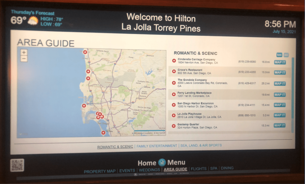
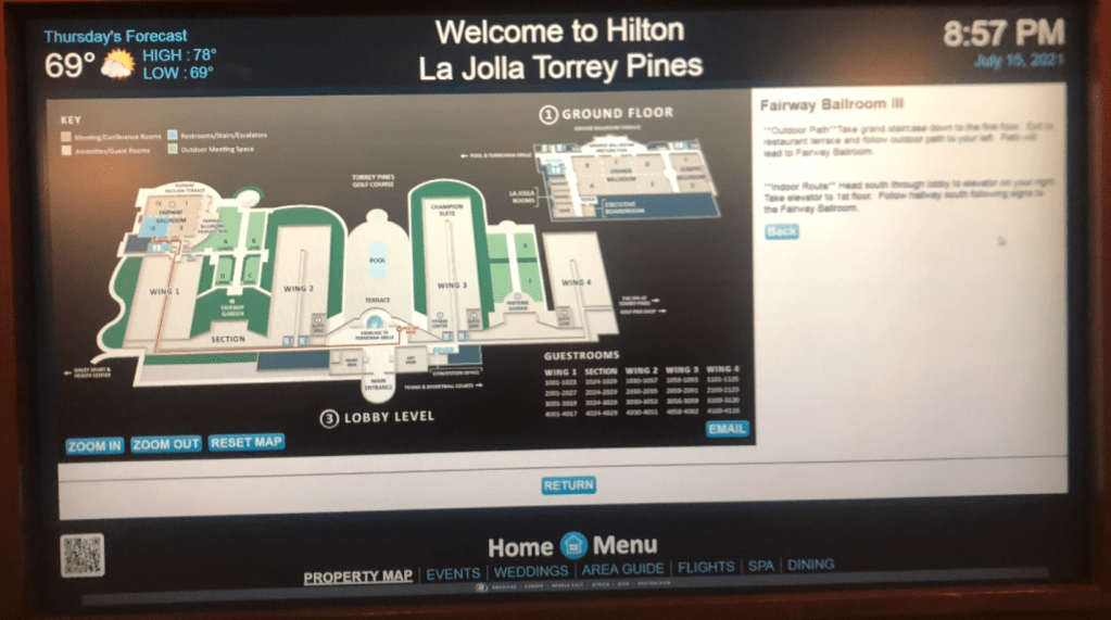
📍Hilton @ La Jolla Torrey Pines:
Secondary Research
- With a growing understanding of the problem and possible solutions, we dove deeper with some good old fashioned desk research
- We had seen several examples of the end-user facing solution, but we needed more info about how that solution comes together
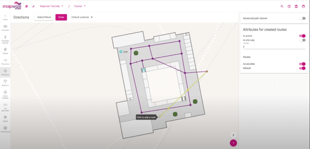
Admin Workflows
- This functionality starts in an admin application, where users create paths (with optional written directions) to each room or point of interest
- Because admin users might be creating directions for multiple floors (or even buildings), we needed to streamline the steps involved
- This includes allowing admins to reuse as much of their work as possible
The research and findings for this admin functionality are very complex, so we will keep it short. But we wanted to show a couple examples of this important part of the process.
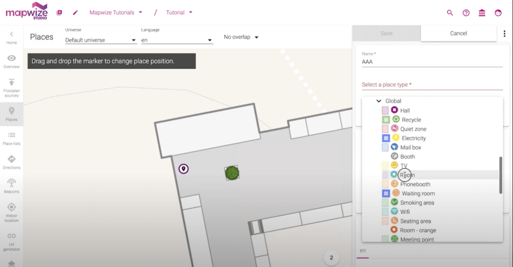
👨💻 Mapwize
- The Mapwize application intuitively separates workflows for adding locations to a floor plan and for adding directions to those locations:
That’s it for the Empathize and Define phases of the Design Thinking Process!
Hotdesking & Hoteling
⚙️ This product is currently in development.
We created the hotdesking touch panel as a solution for hybrid work spaces.
- In a hybrid work environment, sometimes spaces (e.g. desks, cubes) are not permanently assigned
- People can reserve a workspace in advance, also known as hoteling
- People can also reserve a space ad hoc, also known as hotdesking
- This smaller touch panel provides most of the same functionality as the larger panels do, with slightly different workflows to support these flexible models of working.
Prototype & Test
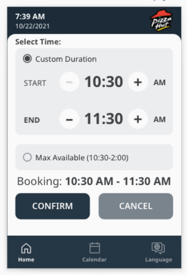
We have conducted 3 rounds of usability testing so far, all with internal users who are representative of our end users. This section focuses specifically on setting the duration for a reservation.
- In talking with users, we learned that one of the key differences in reserving a meeting room vs reserving a desk, is the amount of time the user(s) will need the space
- People usually book rooms in predictable time increments (30 min, 1 hour, etc), but a desk reservation can range from 5 minutes to a full 8 hour work day
- We iterated through multiple workflows which gave users greater control over the length of their reservation:
- One of our first iterations, this basic flow allowed users to increase/decrease the duration by a set increment (15min, 30min, etc)
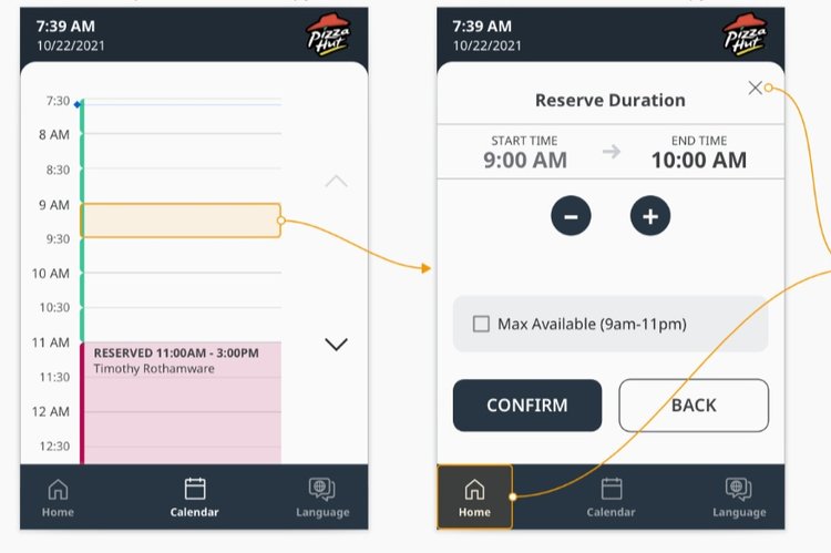
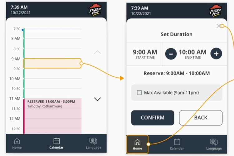
- This iteration gave users some quick default options, in addition to setting a custom duration

Initial Findings
Our first round of usability testing validated the overall user flows.
- Users liked having a quick option to reserve from the home screen
- Users also liked having the option to book via the calendar
Second Round
We got more specific in this round, testing each step for creating a new reservation.
- This helped us understand which option users were more likely to choose
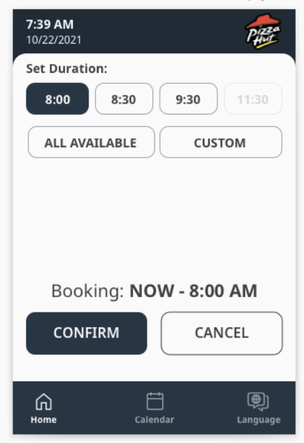
- We found most users want to customize the duration of their reservation
- They also liked having the default custom duration = 1 hour, because they felt that is a good starting duration
- NUGGET: If users are setting a custom duration, they probably don’t know exactly how long they will be working and aren’t too concerned about having to extend/release their reservation
Third Round
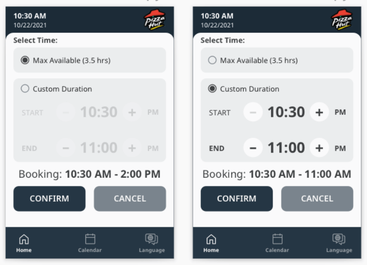
With the workflows and general layouts defined, we tested the granular controls and multiple ways of representing time:
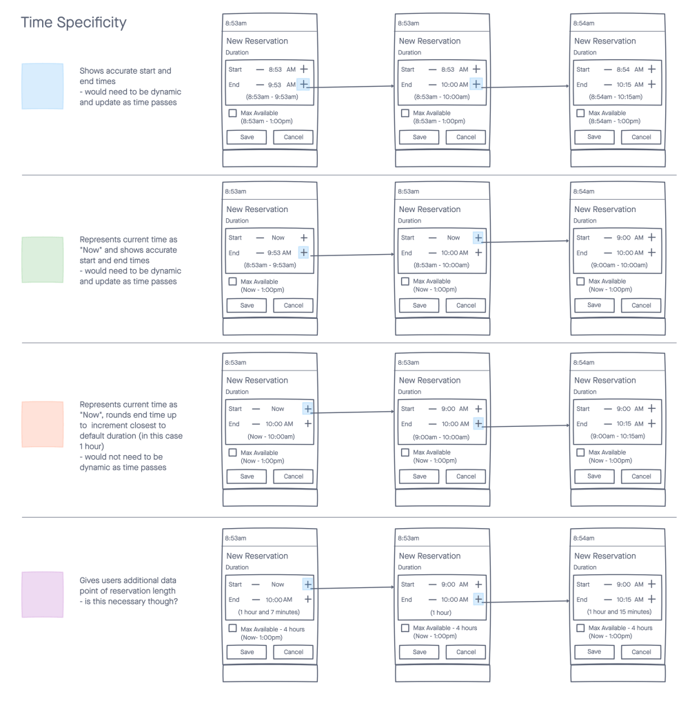
Conclusions
- We got great feedback on expectations for the individual controls
- For example, multiple users expected to rapidly increase the duration by holding the ➕ button down (rather than pressing it over and over)
- Next step will be testing on the hardware, once it’s actually built
That’s it for the Empathize and Define phases of the Design Thinking Process!
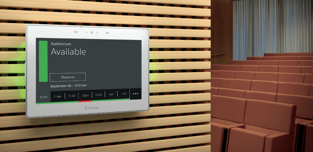
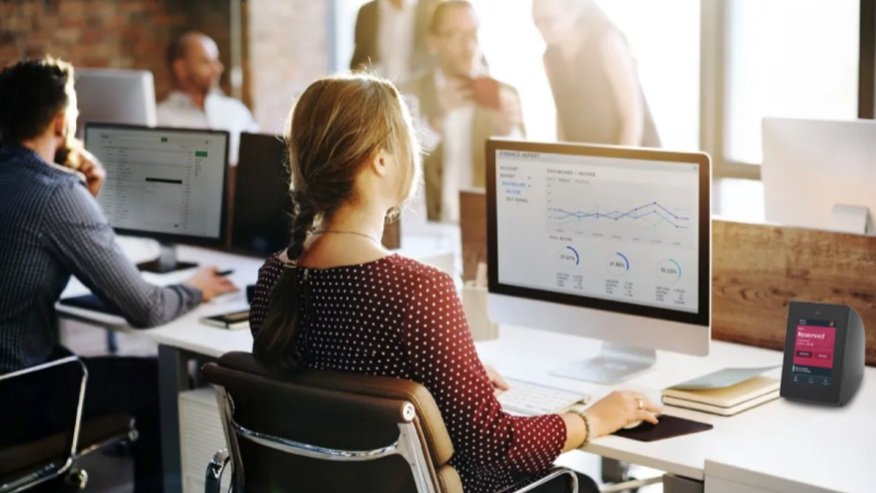
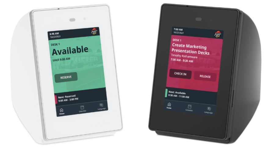
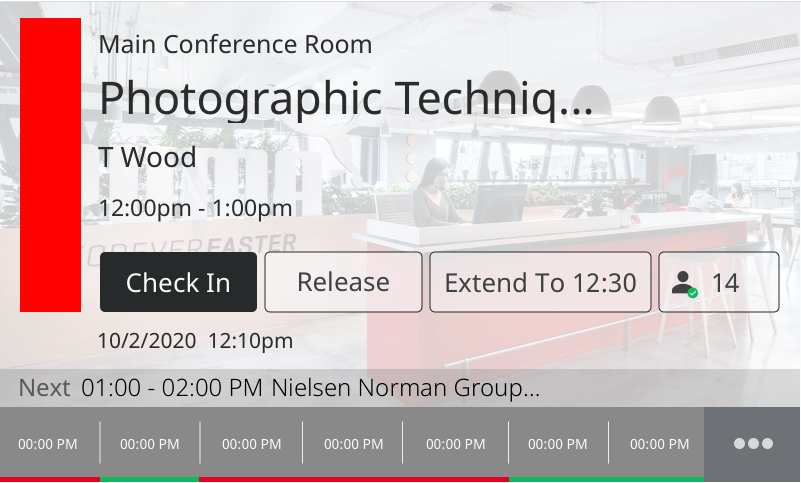
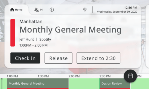
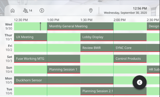
Scheduling Touch Panels
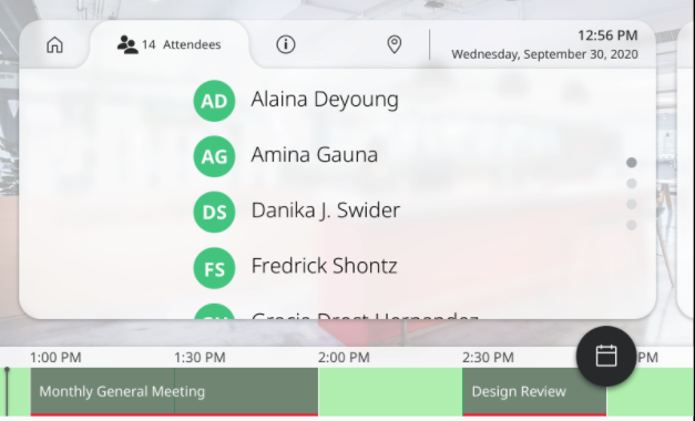
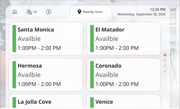
Our TouchLink® Scheduling panels enable users to reserve collaboration spaces ad hoc or via their calendar server (Outlook, Google, etc.).
- The current scheduling panels are built on the Qt framework, and they were designed long, long ago
- This has limited our ability to update the existing visual design and to introduce any animation
- BUT there is an update to HTML5 on the 2022 roadmap, and we can’t wait!
Important Call Outs
- We have worked hard to incorporate elements from our Design System, so that the panels are cohesive with our software applications
- There are important considerations for interacting with these panels that differ significantly from other platforms, such as:
- they may be viewed from up to 12 feet away
- they require additional language support
- they do not currently support common gestures (e.g. scrolling, pinch and zoom)
Iterate
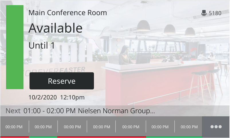
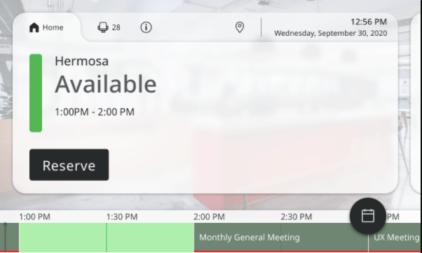
Specific Updates
- We made the design more intentional by adding a container and implementing tabs across the top
- Over time, UI elements were added as more functionality was built in, and eventually the Design team just made things fit
- This also put the focus on the content (where it should be), rather than on the background image
- Marketing and branding is important, but shouldn’t distract users from their goals
- We elongated the timeline, and adjusted the color scheme so that time slot status is more obvious
- We keyed into pre-attentive processing by implementing well-known icons
- We added a FAB to give users quick access to the room’s calendar
- We added a greater range of typographic styles to better enforce the hierarchy of information
More concepts:
That’s it for the Iterate phase of the Design Thinking Process, for now!
What’s Next?
📊 More Usability Testing
🔄 More Iteration
This product space is incredibly active right now. Since the Pandemic, the demand for better control of and more insight into meeting spaces has increased dramatically. The same is true for the demand for flexible work environments.
There are multiple products currently in design, and even more being evaluated for market fit within this ecosystem.
