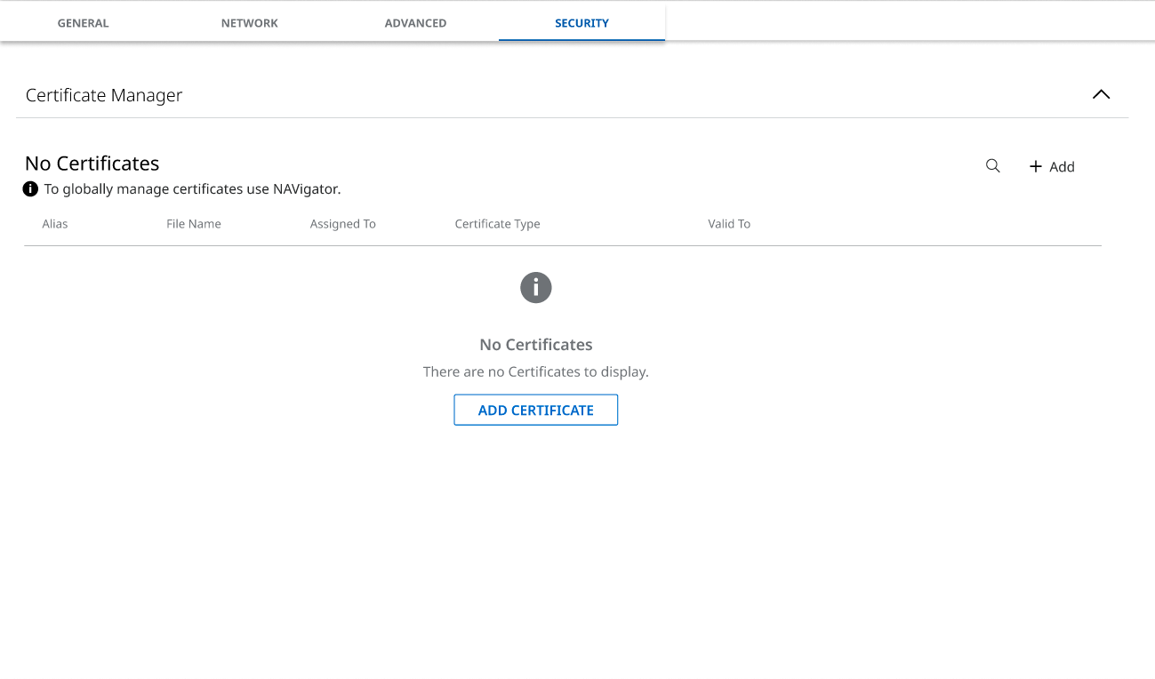
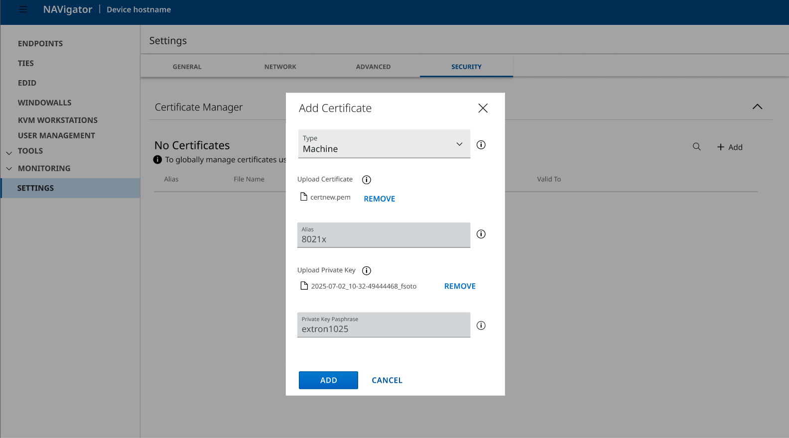
Certificate Manager
Reducing Cognitive Load in a High-Risk Configuration Flow

Certificate management controls encryption, authentication, and system trust.
Small configuration errors can cause outages, failed device communication, or security gaps.
Yet the existing experience treated it like a simple form.
Through usability testing, I uncovered a deeper issue:
Users weren’t failing — they were hesitating. They second-guessed certificate types, relied on file extensions to infer meaning, and hovered over icons for reassurance.
The problem wasn’t usability.
It was cognitive load inside a high-risk system.
Qualitative research and card sorting revealed a core insight:
Users think in phases — not in form fields.
I restructured the experience into guided stages:
Understand → Alias → Upload → Secure
By aligning the interface with real mental models, I reduced decision ambiguity and designed for confidence — not just completion.
This project reflects how I approach complex systems: structure first, polish second.
Want the full story?
If you’re curious how the research shaped the solution, keep reading.
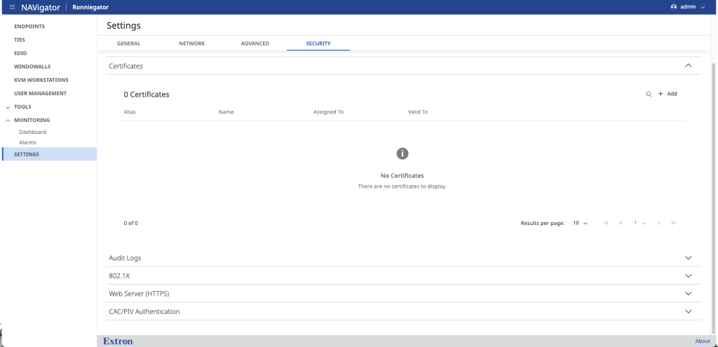
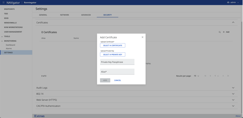
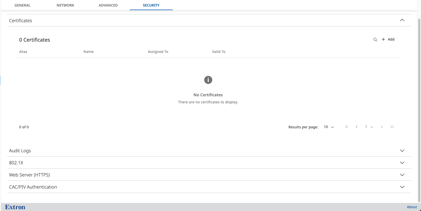
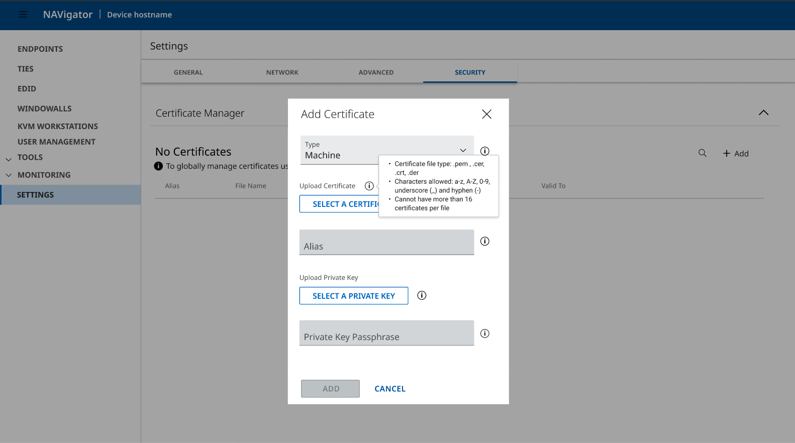
What Is Add Certificate?
A workflow that allows administrators to upload digital certificates and private keys to secure:
- HTTPS communication
- Device authentication
- System trust relationships
Because certificates directly impact encryption and access, even small mistakes can disrupt connectivity or introduce risk.
This is a security-critical configuration step — not a casual task.
Overview
Adding certificates is a high-stakes task. Errors increase setup time, introduce security risk, and generate support overhead.
User testing revealed consistent hesitation and low confidence during the Add Certificate flow — particularly around certificate type selection and file upload.
The challenge wasn’t task failure.
It was invisible friction.
The Problem
Across usability sessions, users:
- Hesitated during certificate type selection
- Relied on guesswork to choose correct file types
- Hovered over icons looking for clarification
- Felt uncertain about where Certificate Manager lived in navigation
“I’m not terribly familiar with certificates… I’d probably just guess.”
— Applications Engineer, 8 years experience
Even experienced engineers described the flow as cognitively heavy.
The issue wasn’t task failure.
It was lack of confidence while completing the task.
The system worked.
But it demanded too much mental effort.
Research Approach
Method
- 2 pilot sessions
- 7 qualitative usability sessions
- Card sorting to uncover mental models
- Remote moderated sessions via Microsoft Teams
Participants
- Applications Engineers
- QA Engineers
- Design Engineers
- Mixed familiarity with certificates and the product
Tasks Evaluated
- Add Certificate (Machine)
- Add Certificate (CA)
- View Details
- Replace Certificate
- Delete Certificate
- Card sorting for information architecture
Key Findings
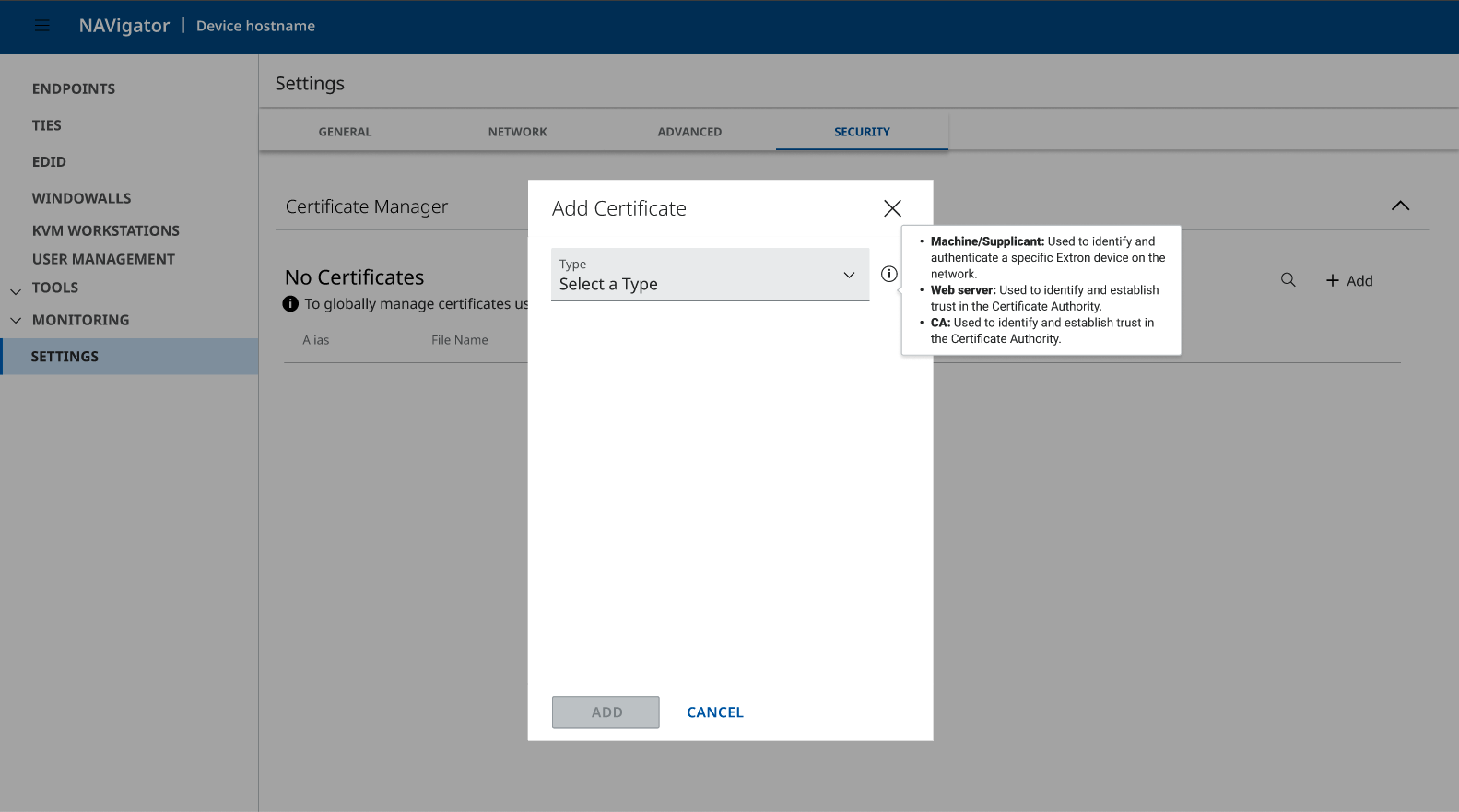
1. Navigation Expectations Were Inconsistent
Users initially expected the feature under:
- Tools
- User Management
- Settings
However, once reasoning through the task, most converged on:
Settings → Security
This inconsistency signals an IA clarity problem.
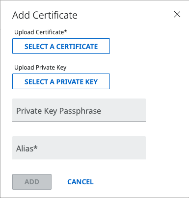
2. The Add Certificate Flow Was Cognitively Heavy
All users completed tasks successfully.
However:
- First-time confidence was low
- Certificate type selection caused hesitation
- File upload felt like trial-and-error
- Users relied on file names and extensions to infer meaning
The problem was not usability failure.
It was decision ambiguity.
3. Mental Models Fell Into Two Clear Patterns
Card sorting revealed two dominant mental models:


Informational Model
Users grouped:
- Certificate type
- Alias
- Passphrase
- Validation rules
Separately from:
- Upload certificate
- Upload private key
Procedural Model
Users prioritized:
- Upload first
- Configuration second
Both models revealed the same insight:
Users prefer phased progression rather than a dense, single-screen form.
The Core Insight
Users don’t think in form fields.
They think in stages.
The original flow required users to:
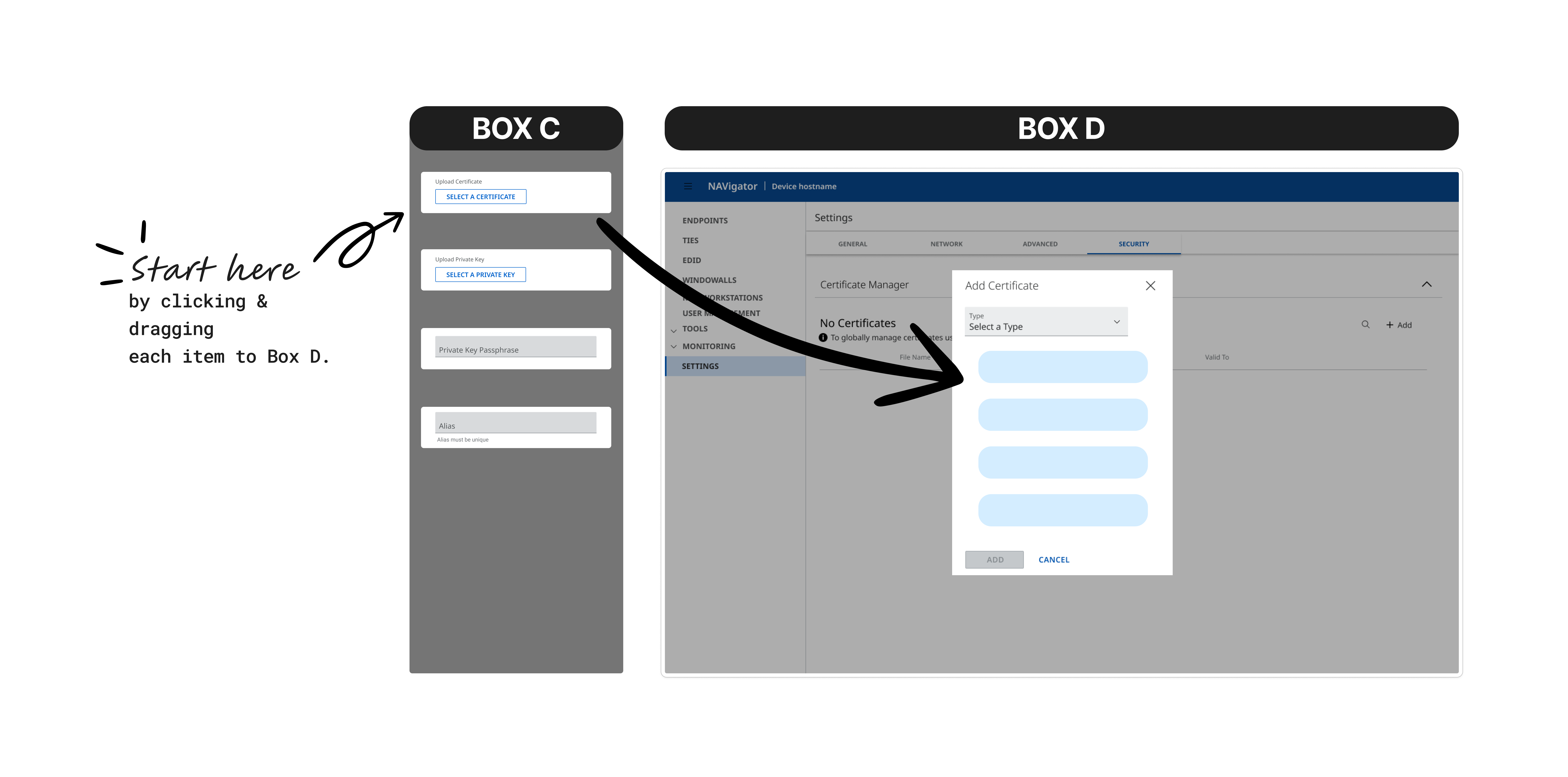
Find Feature → Select Type → Enter Alias → Upload File → Save
Without structural guidance.
This increased cognitive load and hesitation.
The Solution
1. Rename for Clarity
From: Certificates
To: Certificate Manager
Clearer. Action-oriented. Easier to find.
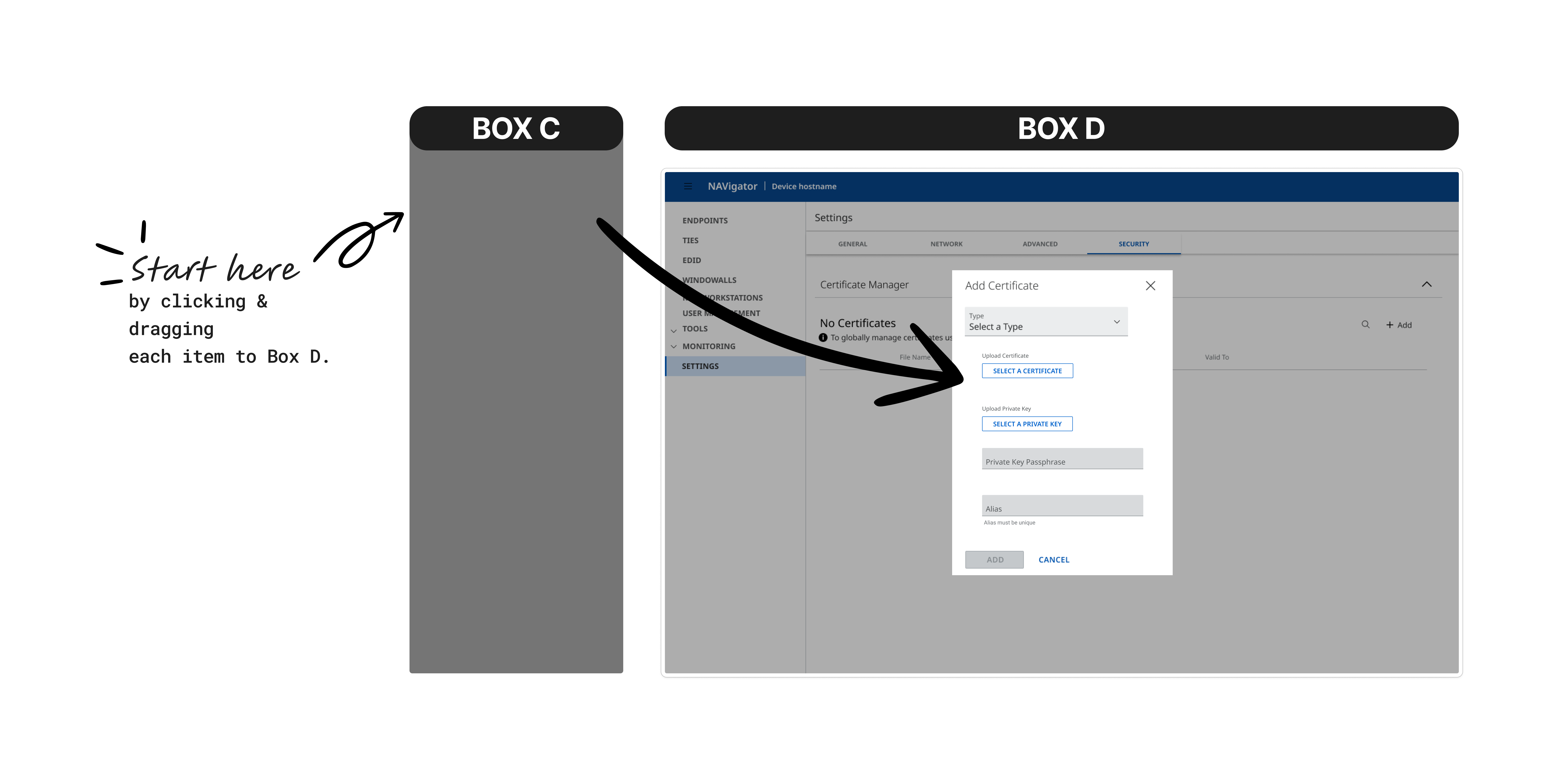
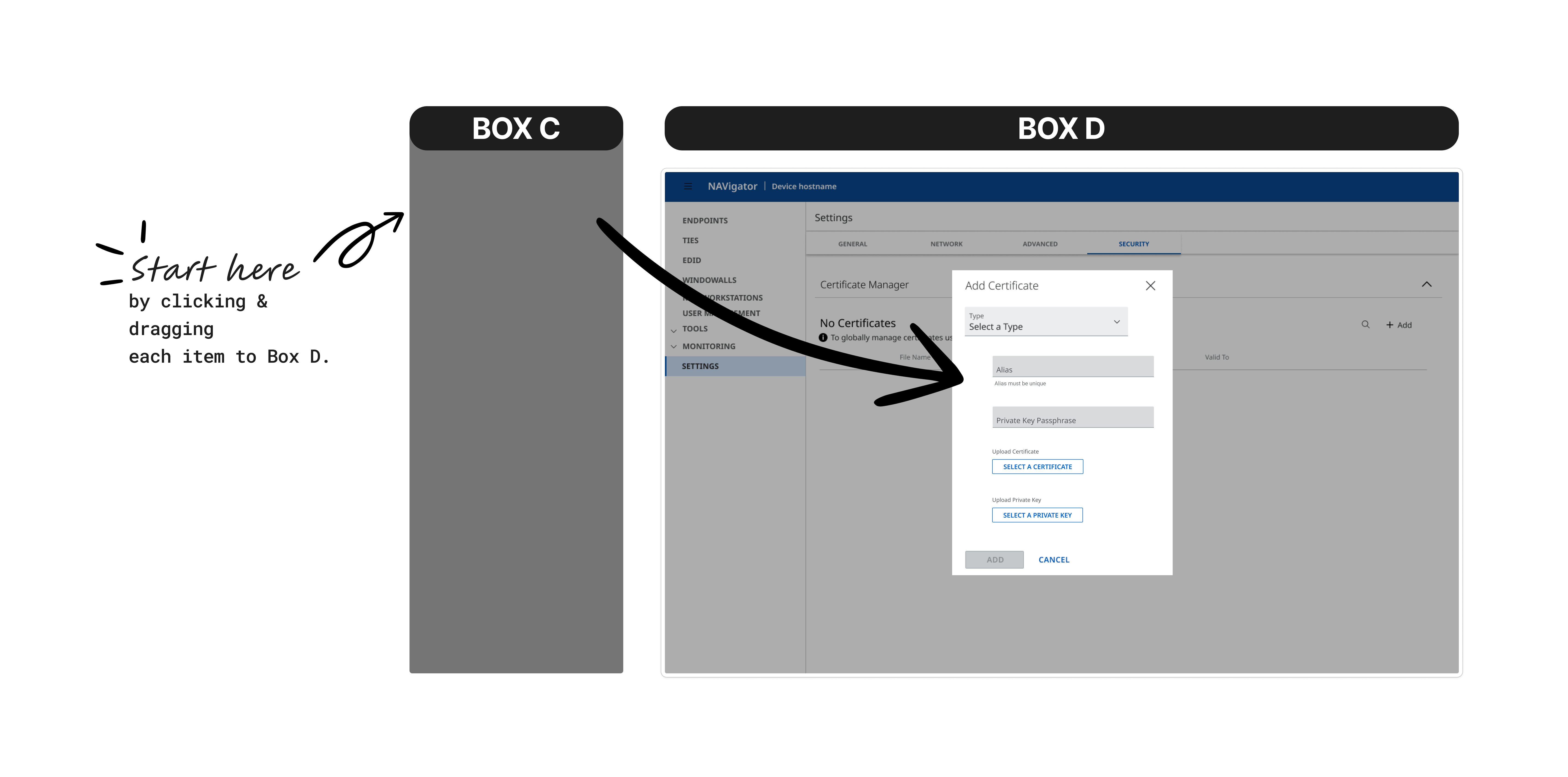
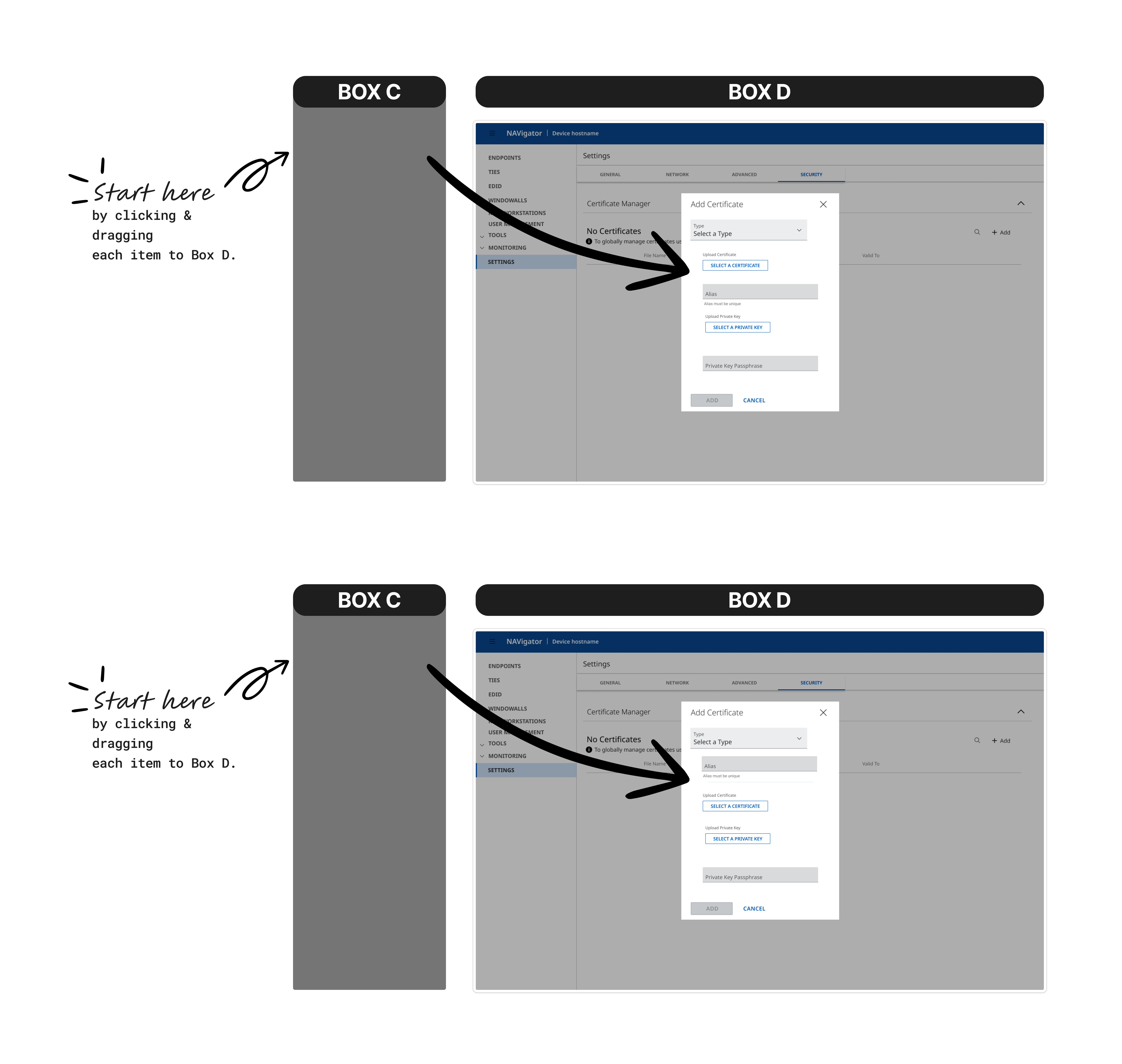
2. Reorder the Flow into Clear Phases
New structured experience:
Understand → Upload → Alias → Secure
Each stage:
- Has a clear purpose
- Reduces simultaneous decisions
- Builds confidence step by step
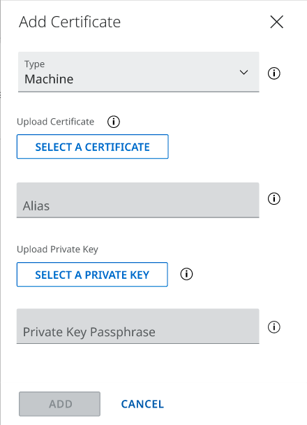
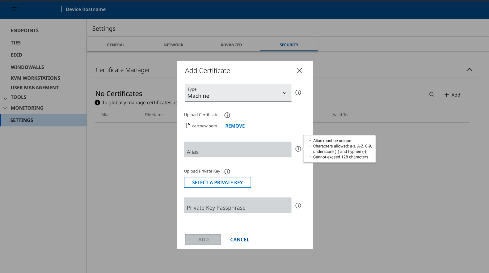
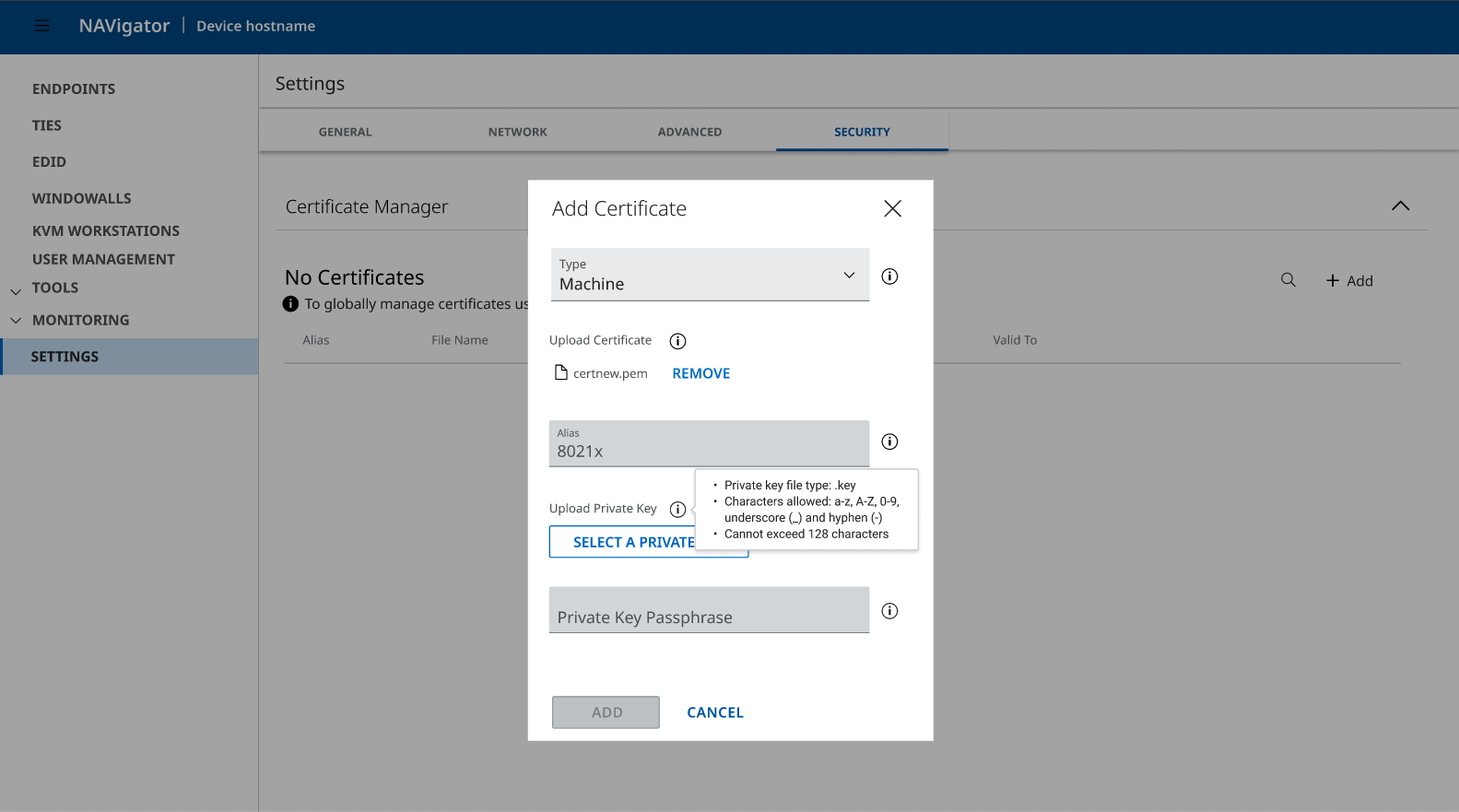
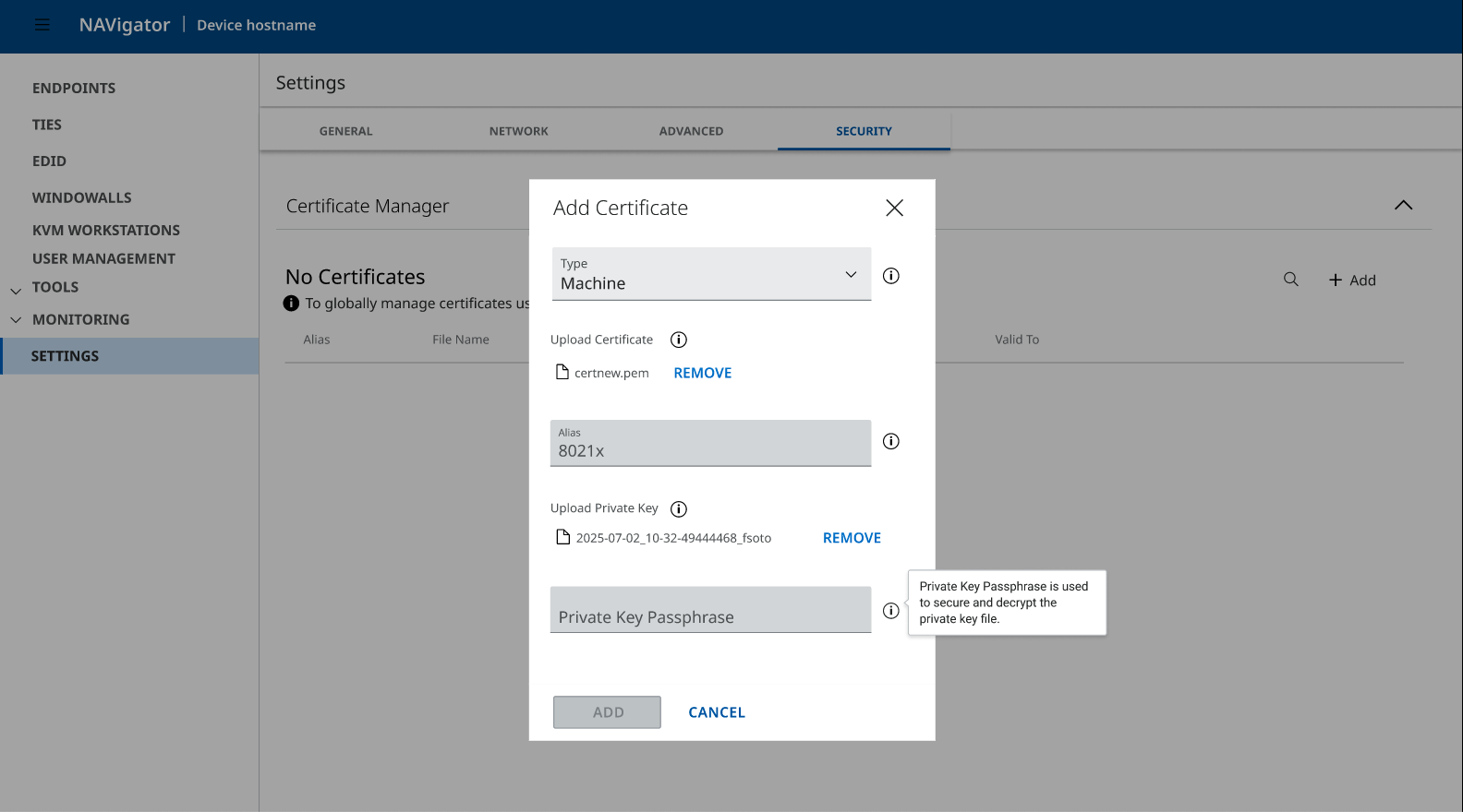
3. Add Contextual Guidance
- Meaningful tooltips
- Clear certificate type explanations
- Explicit file expectations
Users no longer rely on guessing.
4. Improve Discoverability
Surface Certificate Manager as a standalone navigation item instead of nesting under Tools.
This reduces friction and aligns with user expectations.
Before vs After
Before

- Fragmented
- Dense
- Requires prior knowledge
- Unclear progression
- Users pause and hesitate
After
- Structured progression
- Clear phase boundaries
- Reduced cognitive load
- Decisions made explicit
- Confidence built gradually
Success Metrics (Target)
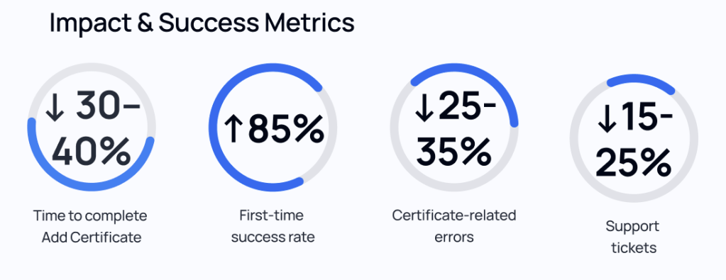
- ⬇ Time to complete Add Certificate: 30–40% reduction
- ⬆ First-time success rate: 85%
- ⬇ Certificate-related errors: 25–35%
- ⬇ Support tickets: 15–25% (lagging indicator)
Business Impact
- Faster onboarding
- Reduced support burden
- Lower configuration errors
- Scalable, consistent experience across products
- Increased user confidence in high-risk workflows
What This Project Demonstrates
This wasn’t a redesign for aesthetics.
It was:
- Information architecture clarity
- Cognitive load reduction
- Mental model alignment
- Confidence design in technical systems
It shows how UX can meaningfully improve expert-facing workflows — not by simplifying complexity away, but by structuring it thoughtfully.
